



Most of what we built in August, you can’t actually see - not in the board, anyway. Which is an odd way to open a release notes post, so let’s get it out of the way first.
Spreo MCP - in Beta
We’ve spent the month building and testing Spreo MCP, a way for AI assistants to read and edit your boards directly. It’s in Beta now. If you would like to try it and help shape the first version, check out the docs.
You can’t spot this update in Spreo itself. MCP lives in whichever AI assistant you connect to it, and the only sign of it on your board is whatever it builds.
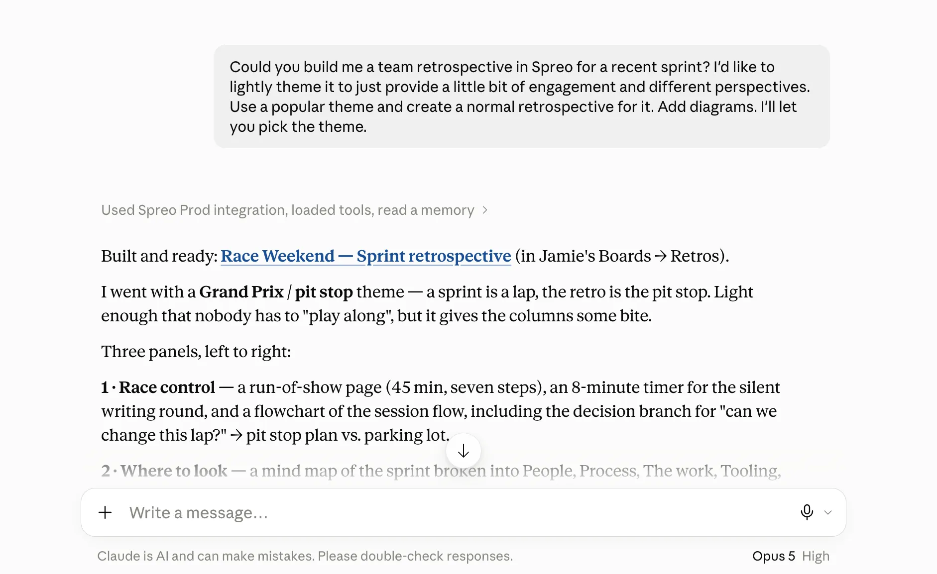
Here’s an example prompt, and the retro board that was built from it:
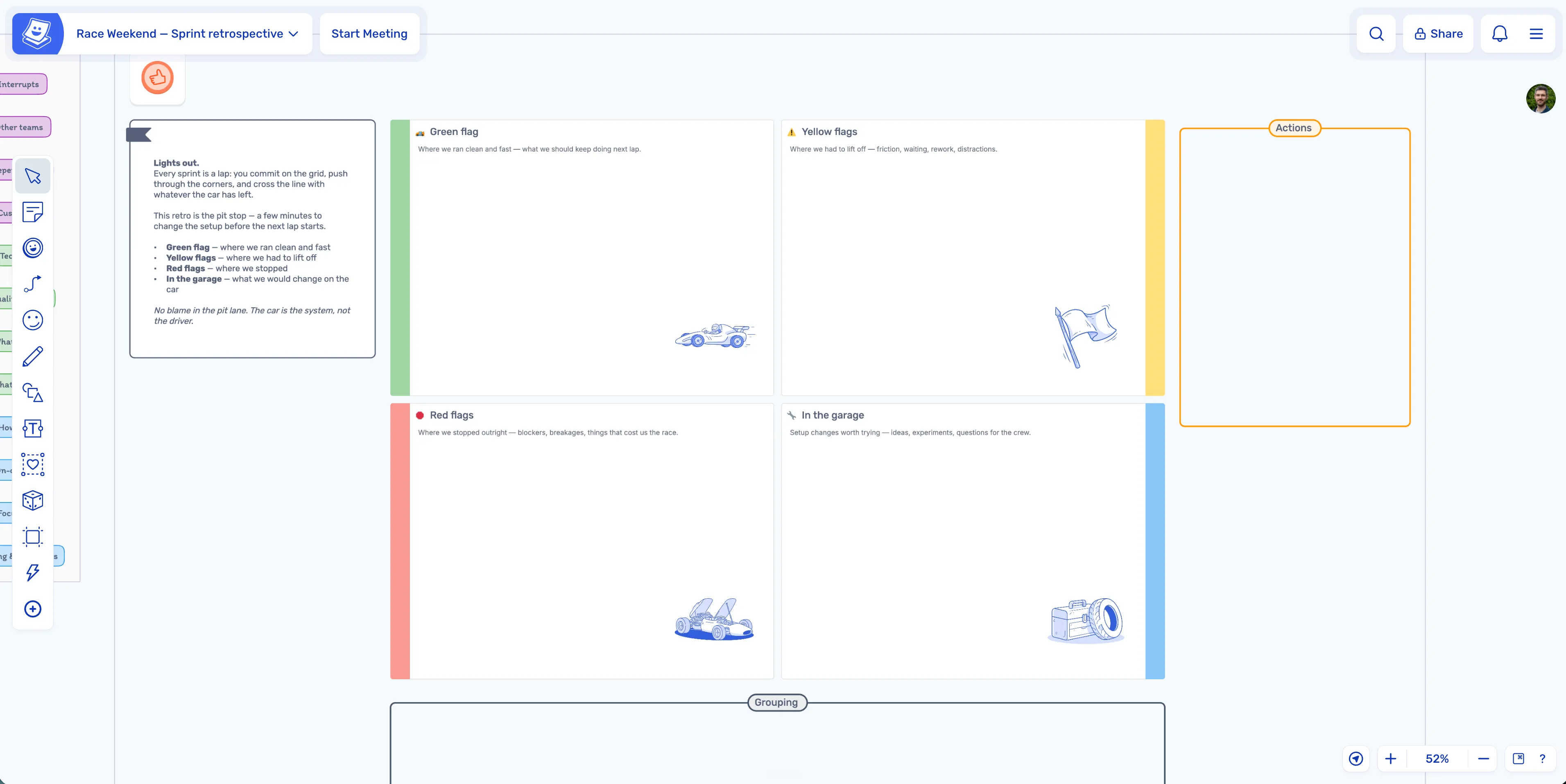
It builds retros, workshops, mind maps, flowcharts, roadmaps, org charts, and timelines, with more to come - and it can extract information from your boards.
The rest of the month went on zones, shapes and the calendar. Those, you can see.
Zones
Zones now snap together. Put one next to another and they’ll join up cleanly, rather than sitting slightly wonky with a gap between them.
You can also turn off the title, the emoji, or both. Sometimes a zone just needs to be a blank canvas and nothing else.
We’ve also added three new styles to give teams more layout control and options for visually distinct areas on boards.
Calendar
Calendars can now cover any date range you like. Pick a start date, pick an end date, and that’s your calendar, two weeks, a quarter, the whole year if you’re feeling ambitious.
We’ve also tidied up how those ranges look. The start and end dates are highlighted, and months are more clearly separated, so a long stretch of planning doesn’t turn into a wall of squares.
Shapes
Text in shapes now resizes sensibly. Previously, resizing a shape could shrink its text to something unreadable or push it out past the edges. That’s fixed, along with the odd margins that came with it.
Shapes now also have a colour opacity slider for when full-strength is a bit much. It allows you to make a stained-glass window effect.